Clarity
For each of the images I made in this exercise, they are all literal, stylistic, and thematic messages that are clearly and efficiently presented. Each word had a different message and used different fonts, shapes and sizes. Overall, they are all working toward the same goal of effectively conveying the message of the word within the word itself. After overlooking each image, I do not believe that any misinterpretation is possible for the piece's image except for the word "brick" because I put an image of a house in place of the "i" and someone could possibly mistake it for trying to convey "brick house". I do not think there is one or more messages fighting for attention because the roof has a separation that creates the dot on the letter "i" but it could maybe be proportioned smaller in the width to create more of a "i" letter. Also, the word Lightly could be interpreted as a message of a underweight object, as an object that is gentle, or as an object that produces light. I clearly put a light in the "i" along with the typical color yellow for light to make sure there is no confusion. Overall, each image has one message and they all can be easily interpreted.
Audience
The target viewer for this piece is my peers in class and my professor. The visual tastes of this demographic segment is crisp, clear images with simple messages. Do be sure of my conclusions I asked a friend in class to review my images and she agreed with my messages and understood them. Colors most preferred by my peers are usually calming shades of blue and green that do not overstimulate the eye and the lingo they will best respond to will probably be the same as my lingo because we are all around the same age and are studying at a university, so higher level vocabulary. The concepts will in no way "fly over their head" because they are simple words that are used by school children. The products can provide imagination to those who view the messages and possibly create new associations when writing the words used. I personally have never seen any of the images I made before so I am assuming that my design will stand apart from what my audience has already seen before. If each design were a person the XXL would be a really large person that was overweight and probably have facial hair, the Pillow would have clothes made out of feathers and walk barefoot, the Atom would be a very smart skinny person with glasses and a lab coat on, the Brick would be a strong person with dry, tan skin, the Lightly would be an explorer that always carries a flashlight, and the Shred would be a skater with torn up clothes and shoes. The audience would probably think of most of the people as typical stereotypes depicted in movies and amongst social groups.
Purposes
The purpose of each design is supposed to convey a message of the meaning of the word or what comes to your mind when you look at the word and express it by using the word itself and incorporating the message within the text. It is not meant to sell a product but the images could be used in an advertisement setting for a product like a pillow or a brick company. The purpose is meant to persuade the viewer that the image represents the word and this can be interpreted differently by others. There is no client or art director in this exercise but I have shown my professor several of the images along with a classmate. Each image has been simplified to show the sole purpose of the piece and narrowed to show the meaning of the messages.
Monday, April 18, 2011
Tuesday, April 12, 2011
Typographical Conveyance


For this activity, we were given five words to convey using Photoshop. For each word, I used some sort of symbol in either the word itself or beside the word to give it animation. Most of the images were from the Custom Toll in Photoshop but the feather in the word "pillow" was from the internet. This was a creative assignment that I enjoyed. The word I struggled with the most to convey was "xxl" and the easiest one was "atom".
Critical Reflection: Connotation, Attributes, Placement
Connotation:
Throughout this blog I feel that the visual style has been a consistent theme of finished products that have a similar flow of work because it has been all done by myself but each exercise has required different skills so some of the components may not all flow together. Many skills were combined as we continued through the semester and we are more experienced with tools like Photoshop and Power point. The thematic goal of this blog is to showcase my work but the work being presented is also in many cases the first time I have experimented with certain elements so while I am pleased with my work it is also a beginners work. The theme is neither too specific or too broad because many elements were used like font, emotion, color echo, colors, etc. and while they are all in the same category of media they are all different. Some of my work could be slightly adjusted with proportions or quality-of-finish but I am happy with my color and font choices. It would be helpful to show the compositional element to my classmates to get constructive criticism or acceptance.
Attributes:
Overall, I am satisfied with the components of style in my blog entries. With any work made a person could look back and critique their finished product but I have reviewed all of my activities and am pleased with them. Most of my works have backdrops that I am happy with especially the color echo and emotional design exercises. The theme of the color echo was colorful lips and I matched the backdrop with the same colors in vertical lines that I think looks really good. For the emotional design exercise my partner and I put a carpet texture in the backdrop of the paper shredder to make it look more realistic and I am very pleased with it. Most of the other ones are existing pictures with backdrops that I edited but they all follow the theme I wanted it to. Color is one of the main elements I focus on the most when completing the exercises given to us. I am very pleased with the color components I have chosen for each activity. Each color scheme of each element fits well with the scheme of the larger layout in my blog. Every activity is put into its own post to separate the different skills used but when scrolling through them there is a clear theme of consistent work. For every activity I feel comfortable presenting it to the class or to the teacher and if displayed on a computer screen or projector each activity would be large enough to see. Within each activity I chose different fonts to match the theme of the exercise but within my blog I have used the same font in each post to describe what I completed. I like using the same font to show consistency but maybe in future activities I could focus on using a different font that would appeal to a larger audience.
Placement:
Placement is definitely a major component that was considered in each layout of my posts. It should call attention even if it is subtle because it should be visually appealing to everyone who looks at the activities. For each post I always position the product on the top center of the page and if there is an original copy I post that first and then directly below I put the finished product. This shows the reader what I started with or what I made from scratch first and then they can scroll down and read about what skills and tools I used to make the product and how I feel about it. I keep my images in the center and then begin to type flush left which is how the eye flows when looking at stimuli. Grouping the images and text together is important but also spacing it out so the reader doesn't feel overwhelmed is important so I always leave some space in between the images and text so that there is a clear separation. For some of my images I either have to enlarge the product like with the font activity, or i have to size it smaller so it doesn't overtake the entire post like the echo color activity.
This blog has not only helped me organize the exercises we do in class but it showing me the improvements I have made since the beginning of the semester and I could potentially use it as a resource to showcase my work to a future client.
Thursday, April 7, 2011
Fonts and Images

For this exercise, we were asked to make a logo for a fake business/company and to use an image from Photoshop and incorporate it with our logo. I chose a light bulb from the custom tools and made it the dot in the "I". I chose the font Century Gothic because it has a fresh, crisp look that matches the logo Bright Minds, Inc. This was a quick activity and it taught me that images can be put into logos without looking phony and unprofessional.
Tuesday, April 5, 2011
Word Portraits
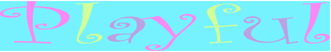
In this exercise, we were asked to choose a font and then write a word that is representative of the font. I thought it would take a long time to find the proper word and font combination but I quickly found two fonts I liked and thought of two words that I felt fit properly. The first font I chose was Curlz MT and I wrote the word "playful" and made each letter a bright color and then made a colorful background to fit the word. Next, I chose the font Stencil std and wrote the word "confidential" in red and all caps. I am happy with both words but I like the first word the best. This exercise brought to my attention that font is important.
Emotional Design
Original inspiration

Final Product

This exercise required that we take an everyday object and transform it to show emotion. My partner and I (Katie Casey) first started with a few different objects but we found it hard to convey an emotion. Then, we decided to make a paper shredder show fear. We imagined how we were scared of them when we were younger and decided to try and create a monster face on the top of the shredder. We used Photoshop to create the entire image and used the top picture as a guide. This was a fun exercise and really challenged our skills. I now feel comfortable with Photoshop after this exercise.
Tuesday, March 22, 2011
Color Echo
Original (from web)

Color Echo

For this exercise, I found an image of colorful lips off of a make-up website and then opened it into Photoshop to create the bottom image.I used the lasso tool to isolate the lips then I took them and put it on a new layer. Then, I used the color echo to get the colors from the lips onto the vertical stripes. This was a strenuous, time consuming process that was at first frustrating but it was worth it in the end product. Up to now, this is the exercise I am most proud of and I also learned the color echo technique.
Echo Color: Hues and Saturation
Original

Hue +62

Saturation -100

The top image is the original image I found from the internet. The second photo is the image with the hue adjusted +62 and it turned the red clouds yellow and the light blue water a shade of indigo. Next, the third image is adjusted -100 in saturation and it made the image a gray-scale. I liked the second image the best because of the colors. This was a fairly easy exercise but extremely useful for future projects I will have.
Thursday, March 17, 2011
Second Life Prim

Using Second Life in class, I created the object above. I used a cylinder shape, a tie-dye pattern, and a fuchsia color. Although the shape might look simple, it was challenging to create and I felt overwhelmed with the vast amounts of choices available. After my object was created, there were a couple of glitches with the program and the ball was attached to my Second Life character for a day so this picture was hard to take without my character getting in the way of the picture.If i were given more time I would go back and maybe make a more creative shape but overall I am proud of my prim object.
Legibility and text safe areas

I created this general invitation that could be used for anything from a dinner party to anniversary party or any formal event. I played with the contrast and transparency to create an illusion of sun rays shining on the flowers. Then I used an elegant cursive font to compliment the flowers and background. I liked this exercise and I could see an invitation similar to this in a store and it is a useful skill to know.
Thursday, February 24, 2011
Icon
For this activity, we went on the internet and chose a single object that we felt had identifiable traits. I chose a sailboat i the water. The most identifiable part of the sailboat is definitely the sails. Other important parts are the stern and the rails on the boat. The tiny windows are also a classic characteristic along with the steering wheel even though it is hard to identify in my picture.


Next, we were told to make an icon using basic shapes that would identify the sailboat. I took a triangle and elongated it to make a sail and then used two lines to identify that there are two sails next to each other. I enjoyed this activity and feel like my icon is a clear representation of a sailboat.

Gestalt principles: closure
I chose the closure principle that says we attach meaning to visual displays. I used Powerpoint and chose a shape that was copied 4 times and then put into a square like shape that made an illusion of a diamond. I took my finished product to Photoshop and cropped it to focus more on the shape. This was a fun activity and if given more time, many more examples could have been made. Also, taking a second look at my work, I felt I also covered the proximity principle that says we group things that are physically close to one another, in a meaningful way. When I look at this I also see a frame-like shape that my eyes naturally group the separate shapes together.


Wednesday, February 23, 2011
C.A.P. Critical Reflection
Connection:
So far in my visual literacy class I have done many activities that have broadened my knowledge and skills with making and editing visuals. Along with a scrapbook we are doing for the class, we also have this blog that we post the activities we do in class and discuss what we did and how we feel about our work. The activities we have done so far are horizon lines, golden section, grouping concepts, alignment, and color & emphasis. Some of the visuals I created in the grouping concepts could be more direct and have better connections to represent the words that I portrayed with shapes. The theme with the alignment activity is clear but could have been more connecting to the viewer. Overall, the majority of the visuals could be slightly adjusted but I am happy with the outcome. Each activity was posted separately to flow right and prevent confusion to what the goal was for each post. Many of the visuals were cropped to keep the focus on the finished product.
Alignment:
For each activity I have done on the blog, I look at it afterward and make corrections if I feel it is needed. Alignment is one factor that I have focused on and several times I have edited my post to make the visual more visually appealing by adjusting the size and placement of the images and text on my blog. I would have a clear answer for any alignment questions that a potential client might have for me. Some of the visuals I did in the beginning of the semester could be adjusted and cropped to have more of a focus on the visual but they were done on Powerpoint and I did not save them properly to edit them. I am satisfied with the alignment of the majority of my visuals.
Priority:
I believe that each of my visuals are appealing and have connection, proper alignment and good choices of color to reflect the skills I have learned so far. The background of my blog is a water-splash green and I personally think it is better and more appealing than a bland background. I made the postings background a light green that is complementary with the purple text so that the color difference wasn’t severe and blocky. I sized the visuals appropriately to make them the right size compared to the text and other visuals. Many of the visuals are cropped to show the main focus of the skill used but others are appropriately sized to show what is important. Some of the visuals in the grouping concepts could be sized differently to show emphasis. I took my time when I chose the colors that are complementary to each other. I also made some backgrounds black or another color to focus on the visual. I reviewed each post and made some adjustments that made the overall post better visually including text size and position of pictures.
Tuesday, February 22, 2011
Color & Emphasis: Past and Present
For this exercise that we also did in class, we took a "street scene" color image from the internet. Then we chose one aspect of the photo to keep in color that looked aged and made the rest black and white or anyway to make it look from the past. Next, I used the magnetic lasso and cut out the stairs in the middle of the image and then "Select" "Inverse" and made the background black and white. I was very pleased with the image afterwards and thought it looked better than the original.
BEFORE


BEFORE

AFTER

Color & Emphasis
In this exercise that we did during class, I took a picture of a flower from the internet and used the magnetic lasso from Photoshop to cut out only the flower. Next, i opened the picture with Powerpoint and made several copies of it and made them all the same size. Then I lined them up horizontally and made the second to last flower on the right a black and white flower. The point of this activity was to use color to emphasize an object and make it stand out from the others.


BEFORE
AFTER

I enjoyed this activity and think it will be useful in the future for a creative project or making an image on Photoshop or Powerpoint more interesting.
Thursday, February 10, 2011
Alignment

For this assignment we focused on alignment and how to properly use it. We looked at good and bad techniques from the book and then used PowerPoint to create our own slide with proper alignment. I went to StockVault and found a heart and put it on to PowerPoint and then found a ring and used Photoshop and used the magnetic lasso to isolate the ring and then opened it onto Powerpoint. Then, I created a text box and made up a slogan for the image "Valentine's Day" themed, and center aligned the text. I felt that my slide was too plain so i added two line on the left for visual appeal. Finally, I changed the color of the shape s to match my font. I am not thrilled with the quality of my work due to the color options on Powerpoint and I couldn't get rid of the background pink color behind my heart so I think the
colors were not the best but overall it was ok work. I
do not think this would actually be used for a real ad.
Thursday, February 3, 2011
Grouping Concepts
In this activity, we were told to make 7 slides, with 10 shapes on each slide. The shapes could be different for each slide but within the slide they needed to be the same. The activity was to use shape,color, background, and spacing techniques to show 7 emotions.

This slide represents unity. I chose the circle shape and combined all 10 of them to look like 1 barrel. Then, I used the United States colors in sequential order to stand for unity. I think the combination of the colors and the shape signify unity.

This image represents celebration. I had a hard time coming up with a slide for this word using the shapes provided but I decided to go with the sun shape and use bright colors in the background to show happiness, or celebration. This pattern reminds me of a poster or tablecloth that would be at a child's birthday which is a celbration. I stand behind this slide but I also believe this was my least clear portrayal of emotion.

For the isolation slide, I chose the same circles i used in "unity" but made the isolated circle black which stands for desparity and the other 9 circles a green pastel. I didn't choose that color for a particular reason other than a complete oppisite emotion of black. I then chose a gradient background that reminded me of static and "nothingness" to try and emulate how the black circle would feel if it had emotions.

For the "escape" slide, I used 10 arrow shapes pointed in an upward direction. I chose a bubble background that reminded me of the water or ocean and then placed the shapes to look like they were reaching the top of the water or escaping from the water. This concept was the easiest for me to think of and clearly shows what is happening.

This slide is my favorite emotion that I portrayed because I think it is the most clearly conveyed emotion I did. It is lightening shapes combined to look like a giant lightening bolt going down to earth. It reminded me of Zeus casting down his lightening on earth when he was angry or trying to show his power to those who disobeyed him. I chose a black background to emphasize the lightening bolts.

This slide was another challenge for me to make. I had to look up what anarchy meant and even after learning the meaning I found it hard to illustrate the emotion. After trying a few different things, I chose to have 10 "X's" sprawled out randomly on the slide, each a different color to try and convey anti-unity and confusion. I then chose a background that looked like fire because whenever I see protests or "anarchy" in videos of other countries there is usually a fire set by someone.

For this last slide, I chose to take 10 cloud shapes and make my attempt at a brain. I made one cloud shape big and then fit the other 9 cloud shapes within the large one to try and make texture. Then i used the scribble tool and tried to make the different portions of the brain and make the cloud shapes a "brainy" color. I wasn't sure if other people would think it was a brain but I asked to classmates what they thought it was and they told me it looked like one so I went ahead with it. The brain represents thinking and logic so I think it is a clear representation of logic.

This slide represents unity. I chose the circle shape and combined all 10 of them to look like 1 barrel. Then, I used the United States colors in sequential order to stand for unity. I think the combination of the colors and the shape signify unity.


This slide is my favorite emotion that I portrayed because I think it is the most clearly conveyed emotion I did. It is lightening shapes combined to look like a giant lightening bolt going down to earth. It reminded me of Zeus casting down his lightening on earth when he was angry or trying to show his power to those who disobeyed him. I chose a black background to emphasize the lightening bolts.

This slide was another challenge for me to make. I had to look up what anarchy meant and even after learning the meaning I found it hard to illustrate the emotion. After trying a few different things, I chose to have 10 "X's" sprawled out randomly on the slide, each a different color to try and convey anti-unity and confusion. I then chose a background that looked like fire because whenever I see protests or "anarchy" in videos of other countries there is usually a fire set by someone.

For this last slide, I chose to take 10 cloud shapes and make my attempt at a brain. I made one cloud shape big and then fit the other 9 cloud shapes within the large one to try and make texture. Then i used the scribble tool and tried to make the different portions of the brain and make the cloud shapes a "brainy" color. I wasn't sure if other people would think it was a brain but I asked to classmates what they thought it was and they told me it looked like one so I went ahead with it. The brain represents thinking and logic so I think it is a clear representation of logic.
Saturday, January 29, 2011
Narrative: Horizon Lines and Golden Section Ruler
Before

After

Before 

After

This image is also showing horizontal variation but with the focus being the sky. I cropped a good amount of the road out alone some of the sides to show that the focus is the sky. The quality of this work is much better than the first image based on the quality of the image alone but I also prefer the focus of the sky better.
This last image demonstrates the Golden Section Ruler. I constructed this using Photoshop, using the rectangle tool, i made this 13 in. rectangle and then using the ruler, i divided it in half vertically and filled it in black using the paint tool. Then, I made another 5 in rectangle on top of the 13 in. rectangle and filled it in purple using the paint tool. This left 8 in. left for black, making the dimensions for the Golden Section Ruler. Finally, i cropped out the right side of the rectangle that was blank and this was the product. This image was easy to make and would be useful for business cards or for a presentation outline because it is appealing to the eye.
Tuesday, January 18, 2011
"Field Trip"
For Kevin Borg's presentation, he used representational visuals using Google Earth and Google Maps. The purpose of his visuals was to show what the software can do; Upload maps (1921) and then set them on top of the current land and see what is still in existence. He used the town of Harrisonburg and showed and old factory that is now a parking garage. The intended audience for his presentation was JMU students and the surrounding community. The presenter did not explain thoroughly what Google Earth or Google Maps was so those were the assumed "experiences" represented in the visuals along with some prior knowledge of the history of Harrisonburg and existing buildings. His visuals were an accurate representation of what he and his classes had accomplished using Google Earth and Google Maps along with actual maps from 1921. Without the visuals for his presentation I would have not understood what he was talking about so the visuals definitely helped. Most likely Adobe Photoshop and Google Earth were used in his presentation. The projector was used to show the visuals and the quality of Google Earth's images helped get Borg's presentation understood. The presentation only showed a map of Harrisonburg but leaves curiosity to what used to exist in other places such as our individual homes or the JMU campus. Two new terms I learned from his presentation were Geo spatial technology and Sandbox
Steve Whitmeyer's presentation used representational visuals and also an arbitrary visual with the different colored map with shapes and letters. It is assumed that Whitmeyer created the visuals or used a software to create the visuals of the map of Virginia from a geological view. The purpose of the visuals was to show the audience that rock formations could be detected using Google Earth Pro and could affect building projects. The intended audience in JMU students and the community along with potential builders who would be interested in using the software to determine whether they should build on the designated land. An assumed experience of his presentation would be an understanding of geology and what certain rocks are and mean in terms of building and construction. The visuals were an accurate representation of what Whitmeyer was presenting and they made me understand why the software would be a good thing to expand to other states besides Virginia. The presenter probably used Google Earth Pro and Adobe Photoshop and it was presented on a projector. The presentation did not show the complete geological view of the US but led to curiosity of what the rest of the country is made of. I didn't learn any new terminology from his presentation.
Overall, I found each presentation interesting and made me curious to use Google Earth and the possibilities that is has.
Subscribe to:
Comments (Atom)